
Graphic Design Company
for Brands People Actually Remember
Most people won’t read your brochure. They’ll glance at it, decide something about your business in roughly a second, and move on. That snap judgment is what graphic design is really for. Web Harmony is a graphic design company built for that moment, whether it’s a logo shrinking down to a favicon, packaging sitting on a crowded shelf, or a deck someone’s flicking through on their phone. Good design isn’t about taste. It’s about being understood fast.
As a creative graphic design agency we handle the whole range, from a single logo through to a full identity system your team can run without calling us.
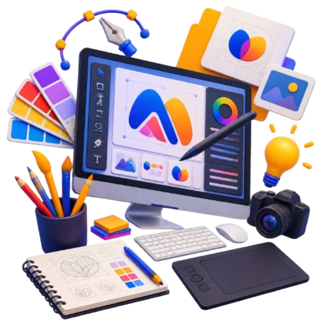
What a Creative Graphic Design Agency Should Get Right First
Design work fails in predictable ways. Type too small to read. Colors that vanish in print. A logo that looks sharp on a monitor and turns to mush on a pen.
So we start with where the thing will actually live. A billboard and an app icon need opposite decisions, and pretending otherwise is how brands end up with assets they can’t use.
Working with a creative graphic design agency should feel practical, not precious. You’ll get options, honest reasoning behind each one, and files that open properly on whatever machine your printer happens to be running.

Where Branding Graphic Design Stops Being Decoration and Starts Working
A logo on its own isn’t a brand. It’s one asset. The brand is what happens when that logo, your colors, your typefaces, and the way you write all pull in the same direction everywhere a customer meets you. Nail that consistency and you look established even when you’re three people in a spare room. Miss it and you look scattered no matter how big you really are. A graphic design company should be building toward that from the first sketch.
Sketching Beats Software
Concepts get worked out on paper before anyone opens Illustrator. Rough, ugly, fast. Sounds old fashioned. It’s still the cheapest way to kill a weak idea, and it stops a project drifting toward whatever the software makes easy rather than what the brand needs.
Tested at the Smallest Size
A mark that only works at poster scale isn’t finished. Every logo gets checked at sixteen pixels, in one color, and reversed out of black. If it falls apart at any of those it goes back on the desk. That’s usually where fussy details get cut.
Print-Ready Means Ready
CMYK conversions, bleed, crop marks, and a proof before anything goes near a press. Printers charge for reruns and they’re rarely sympathetic about it. Enough late night phone calls about color shifting on a job will make anyone careful with this part.
Every Format You’ll Need
Vector source files, web-optimized exports, transparent PNGs, favicon sized properly. Handed over organized instead of dumped into one folder called final_v7. Your printer, your developer, and whoever runs your social accounts each get exactly what they can use.
Rules So It Stays Consistent
Bigger jobs come with a guidelines document. Color codes, clear space, type sizes, what nobody should ever do to the logo. Dull reading, and it’s what keeps a brand from quietly falling apart the week somebody in sales builds their own flyer.
Revisions Without the Awkwardness
Rounds get agreed upfront so nobody’s guessing where the line sits. Most projects settle inside two. If something isn’t landing, say so plainly and it gets reworked. Vague feedback helps no one, and blunt beats polite every time here.
Why a Graphic Design Company Earns Its Fee in Consistency
One good poster is easy. Fifty pieces that still look related eighteen months later, produced by different people, is the genuinely hard part.
That’s the work we take seriously as a graphic design company. Systems, not one-offs. Type scales, color rules, and templates your team can pick up, so the tenth social post still looks like it belongs beside the first.
It’s also why clients come back for the next thing. Once the groundwork exists, everything after it gets faster and cheaper to produce.
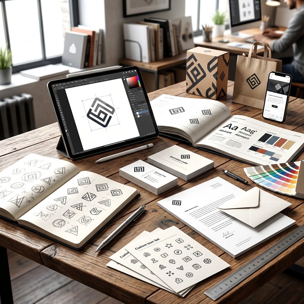
Graphic Design for Brand Identity, Beyond the Logo
Ask most business owners what their brand is and they’ll point at a logo. Fair enough, it’s the visible bit. But branding graphic design covers a whole set of signals, and the logo is maybe a fifth of it.
Strong graphic design for brand identity reaches into tone, spacing, photography style, even how your invoices look. All the small things nobody consciously notices.
Businesses that invest in graphic design for brand identity early tend to spend less later on. You’re not rebuilding from scratch every time a product launches or a new marketing hire arrives with opinions.
Social Media Graphic Design That Stops the Scroll
Feeds move fast and most posts get half a second at best. Social media graphic design has to land at thumbnail size, on a phone, usually with the sound off. We build template sets so your team can produce weeks of content without the look drifting, plus one-off pieces for launches.
Logo Design and Full Identity Systems
Sometimes you need one mark. Sometimes you need the mark plus palette, type choices, icon set, and a document explaining how they fit together. We'll say honestly which one your stage and budget call for, because paying for a full system too early is money sitting idle.
Packaging and Label Work for Physical Products
Shelves are brutal. Your product gets compared against six competitors at once, usually by someone in a hurry already thinking about dinner. Packaging has to say what it is, who it's for, and why it justifies the extra dollar, all before anyone picks it up.
Print Collateral That Doesn't Feel Cheap
Brochures, flyers, business cards, catalogs, signage. Print gets declared dead every few years, then somebody hands you a well made card and you keep it. Paper stock, finish, and folding get considered properly, not just artwork sitting flat on a screen.
Decks and Documents People Finish Reading
Pitch decks, investor materials, sales one-pagers, reports. Most are dense and exhausting. Fixing that comes down to hierarchy and restraint, deciding what earns a slide and what gets cut. Eleven bullet points on one slide is doing nobody any favors.
Infographics, Icons, and Custom Illustration
When stock imagery makes everything look like every other website, custom work is what separates you. Data visualization somebody can actually read, icon sets drawn to match your typeface, and illustration in a style belonging to your brand rather than a subscription library.
Other Visual Work We Take On
Beyond identity projects, clients regularly come to us for ongoing social media graphic design support.
- Motion graphics and short explainer animations
- Email and newsletter template design
- Trade show banners and event signage
- Ebook layouts and digital publication design
Smaller jobs, but they keep a brand looking whole.
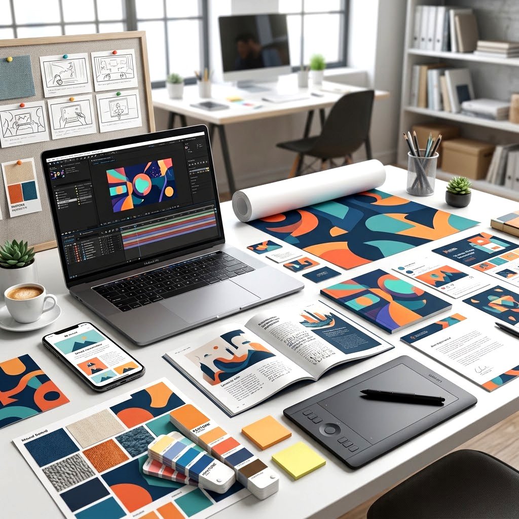
FWA, Site of the Day
- /00 - 1June 25th, 2018.Design and Interaction for The Wall
- /00 - 2October 28th, 2024.Multi-Disciplinary Creative and UI/UX for The Jam
- /00 - 3May 5th, 2021.Design and Interaction for The Amateus Co.
CSS Design Awards
- /00 - 4August 25th, 2019.Creating Original Products by Colin Lucido
- /00 - 5June 25th, 2022.Site of the Day / ESPN Promo Campaign
Articles & Publications
- /00 - 6September 28th, 2024.Mobile Excellence / Lampard Ericksson website
clients
+50 Clients




Web Harmony Works Like an In-House Design Team, Minus the Overhead
You deal with the designer doing the work, not an account manager relaying messages. Feedback goes straight to the person holding the pen, which cuts about a week off most projects and removes the game of telephone where your notes arrive slightly wrong.
Files land when we said they would. If a date has to move, you’ll hear it early rather than on the deadline.
Knowing how print production behaves, why screens render color differently, and what a brand will need at year three instead of week one is the part that experience genuinely buys you.
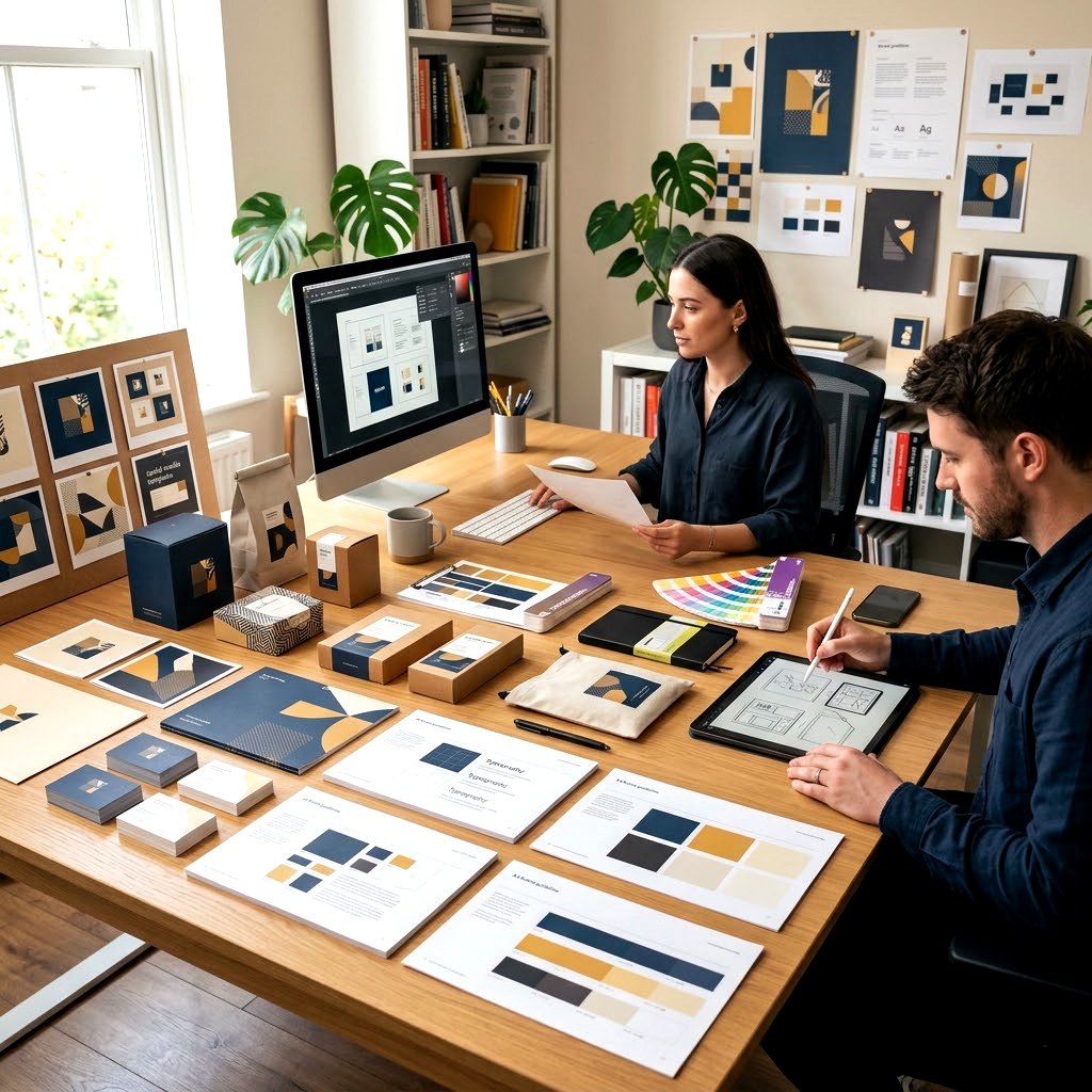
Bring Us the Design Problem You Keep Putting Off
Frequently Asked Questions
It handles visual assets across print and digital, from logos and packaging through to social graphics and presentation layouts.
Brief first, then concepts, then rounds of refinement. You'll see rough directions before anything gets polished.
Yes. Logo stings, short animations, and explainer videos are handled in house alongside the static work.
Mainly Adobe Illustrator, Photoshop, InDesign, and Figma. Editable source files come to you in standard formats.
Two to three weeks for a single mark. Full identity systems usually run four to six weeks.
Of course. A good share of our work is producing new assets under rules somebody else already set.