
Logo Design Company
That Thinks in Decades, Not Trends
A logo is the one asset you can’t quietly swap out. Websites get redesigned every three years and nobody blinks. Change your mark and you’re reprinting signage, re-embroidering uniforms, rewrapping vans, and explaining yourself to customers who liked the old one. So we design for the long version. Web Harmony is a logo design company building marks that hold up in embroidery thread, on a laser-etched pen, and at the size of a browser tab, because that’s where logos actually spend their lives.
No mood boards full of other people’s work. No fifty variations dumped on you at once. Three directions, each with a reason attached.
A Logo Design Agency Should Ask Who Else Is in Your Category
Most category logos look alike. Dentists end up with blue and a tooth. Law firms get columns and a serif. Every landscaper has a leaf in there somewhere. Blending in is what happens when nobody checks.
So the first thing we do is pull up your competitors and put them side by side. Whatever the pattern is, that’s the thing to move away from deliberately rather than by accident.
A logo design agency earning its fee should be able to point at a finished mark and tell you exactly which competitor decision it’s reacting against. Distinctiveness isn’t a happy accident. It’s the whole job.

What It Actually Costs to Replace a Logo Three Years From Now
Signage comes down and goes back up. Uniforms get reordered. Vehicle wraps get stripped and reapplied at several hundred dollars a van. Packaging dies get recut. Stationery, business cards, email signatures, the sign above the door, the stamp on the invoice. None of it is dramatic on its own and together it runs well past what the original logo cost. A logo design company that pushes you toward a trend is handing you that bill early.
Concepts Come From Your Business
We read what you do before drawing anything. Who buys, what they’re choosing between, what you want to be known for in ten years. A mark built on that has something to say. One built off a mood board is just a shape somebody liked on a Tuesday.
Font Licensing Sorted Properly
Typefaces come with licenses and plenty don’t permit commercial logo use. Businesses find this out years later from a letter. We either draw the lettering ourselves or buy the correct license in your name, then hand you the paperwork proving it. Cheap insurance.
Screened Before You Fall in Love
Nothing kills momentum like discovering a competitor two states over registered something nearly identical. Preliminary trademark screening happens while concepts are still rough. We’re designers rather than attorneys, so anything serious goes to a trademark lawyer. Cheaper in week two than year four.
Drawn to Survive Manufacturing
Thin strokes vanish in embroidery thread. Gradients can’t be cut from vinyl. Tight counters fill in when a mark gets etched into metal. Physical production has hard limits, and a logo that ignores them looks fine on screen then falls apart on a jacket.
Designed to Age Well
Trends date fast. The gradient mesh era, the swoosh era, the minimalist sans everyone adopted at once and then regretted. We aim for marks that look deliberate in fifteen years rather than clever this quarter. Boring is underrated when the thing has to last.
Shown Where It Will Live
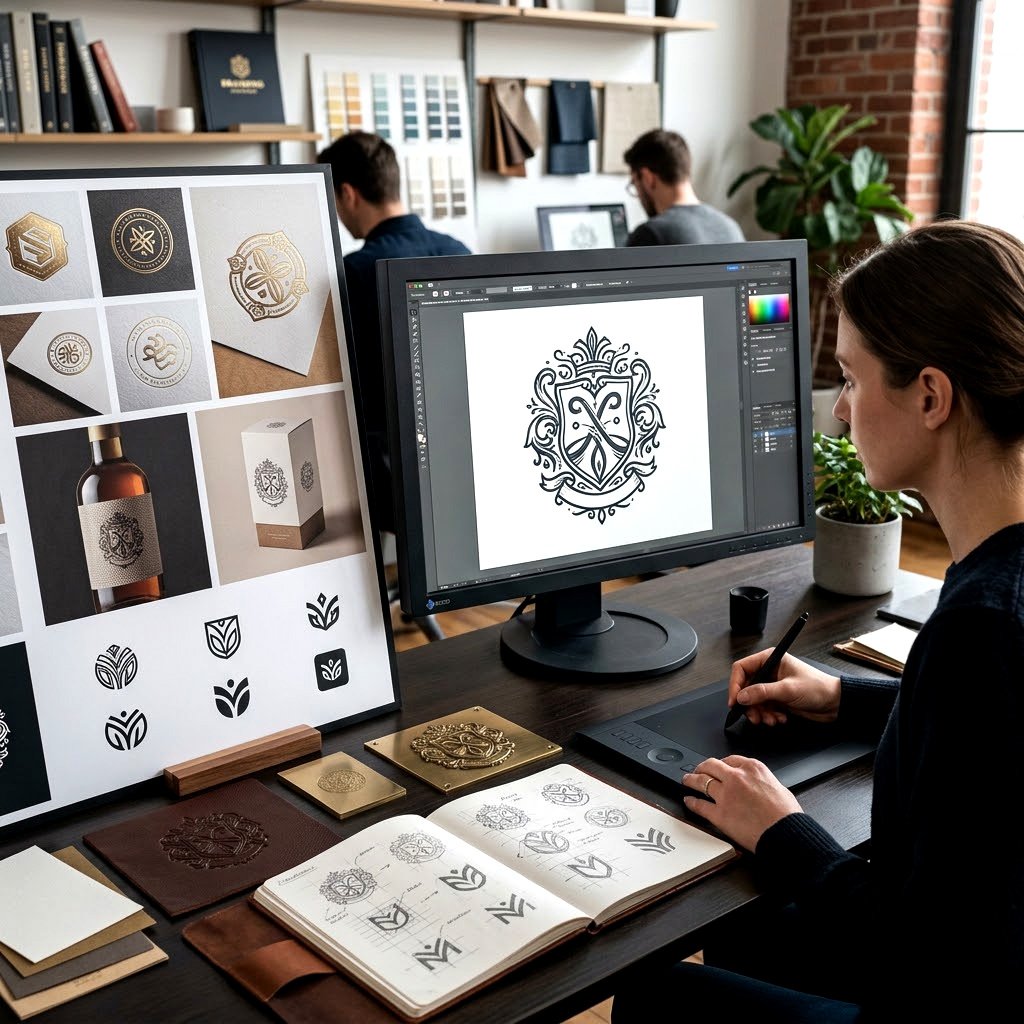
Concepts get presented on the actual things. Storefront, invoice, van door, app icon, the corner of a slide. Judging a logo floating alone on white is how businesses approve marks that stop working the moment they meet the real world.
Custom Logo Design Services Versus a Fifty Dollar Marketplace
Cheap logos exist and some of them look fine. Worth knowing what you’re actually buying and where the gap sits before you decide either way.
Marketplace sellers work fast on volume, which means no competitor research, no trademark screening, no font licensing check, and frequently a design that already sold to someone else. Custom logo design services cost more because those steps take time and someone has to do them.
If you’re testing an idea that might not exist next year, buy cheap. If you’re putting the mark on a building, a fleet, or a product line, don’t.

Six Directions a Logo Can Take
Logo isn’t one thing. There are distinct structural families, and picking the wrong one for your business creates problems no amount of polish will fix later on. A name nobody can spell needs different treatment than a familiar one.
Long company names struggle as wordmarks. Short punchy ones rarely need a symbol at all. Budget matters here too.
We’ll recommend one direction and explain the reasoning, then show you the runners-up so you can see what was considered and rejected. Most clients find the rejected ones as useful as the winner.
Wordmarks and Custom Lettering for Name-Led Brands
When the name itself is the asset, the typography carries everything. Drawing letterforms from scratch rather than setting an existing typeface gives you something nobody else can replicate and sidesteps licensing entirely. Suits businesses whose name is short, distinctive, and already doing work in people's heads.
Symbols and Abstract Marks Built for Recognition
A standalone symbol takes years and real marketing spend to become recognizable on its own. Worth it when you need something that works without language, scales down to a tiny app icon, or has to sit on a product where a full name won't physically fit.
Combination Marks and Lockup Sets
Symbol plus name, arranged into fixed relationships you can drop anywhere. Most businesses need three or four lockups minimum, horizontal for website headers, stacked for square spaces, symbol alone for favicons and social. Built as a set so nobody improvises badly at two in the morning.
Emblems, Badges, and Crest-Style Marks
Everything contained inside one shape. Traditional, trust-heavy, and genuinely useful for trades, food and drink, education, and anything wanting to look established. The catch is scale, since detail packed into a circle disappears fast, so we usually build a simplified version alongside it.
Logo Refresh Without Losing What You Built
Established businesses often don't need a new mark, they need the existing one repaired. Cleaning up the drawing, fixing spacing, modernizing the type, sorting out the versions that drifted over the years. Customers barely notice the change, which is precisely the point of doing it this way.
Secondary Marks and Submarks for Everyday Use
The primary logo isn't right for every situation. A monogram for social avatars, a simplified badge for packaging, an icon for app screens. These get designed together so the family holds, rather than being invented one at a time by whoever needs something urgently.
Things Clients Need After Sign-Off
The mark is finished. Then real life starts asking for things.
- Stationery, cards, and email signature templates
- Vehicle livery and storefront signage artwork
- Social profile assets sized for every platform
- Brand guideline documents for internal teams
Small jobs, and they keep the mark from drifting.
Feedback That Moves a Logo Forward, and Feedback That Stalls It
Make it pop is the feedback everyone dreads, mostly because nobody can act on it. What helps is telling us what’s wrong rather than what to change. Too corporate, too playful, reminds me of a competitor, my business partner hates the color. All useful. All actionable.
Two rounds of revision come standard. Most projects settle inside one once the reasoning is on the table.
One more thing worth saying out loud. Don’t poll your friends. Twelve opinions from people who aren’t your customers is the fastest route to a mark that pleases nobody.
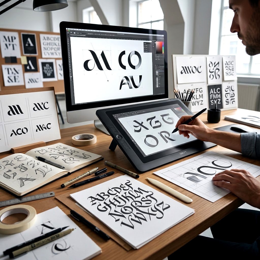
Send Us the Logo You Keep Apologizing For
Or the blank page, if you’re starting fresh. Tell us the business, who buys from you, and what you’re up against. You’ll get a straight answer on direction, timeline, and cost within a couple of days. A logo design company should be able to explain its thinking before you’ve paid anything.
Frequently Asked Questions
It researches your market, screens for conflicts, and draws something built for your business rather than resold.
Yes. Color systems, typography, and usage rules that keep things consistent once other people start applying them.
Three developed directions, not fifty thumbnails. Each comes with written reasoning so you're judging thinking, not shapes.
Yes, in full, transferred in writing on final payment. Source files and font licenses come with it.
Often, yes. Client sketches reveal what matters to you, even when the drawing itself doesn't survive.
Worth doing if the mark matters commercially. We flag obvious conflicts early, then an attorney handles the filing.